There are two kinds of bookshelves in photographs. One is full of books arranged by color, with a few perfectly placed ceramic pots and a vase of eucalyptus that has been there for three years. The other is the one you own, where books are two deep, a stack of papers leans on a plant and a charging cable runs along the second shelf. The goal of styling is to get the second to look like the first, without losing the books, and without making the shelf a museum.
This guide gives rules that you can apply to any bookshelf: how to arrange books vertically and horizontally, how much space to leave, how to spread weight, how to choose objects and how to create a rhythm that carries the eye across the unit. It also covers the shelf in a small room, the shelf with a TV and the shelf with children, where the aim is function first.
Start by emptying and sorting
The best bookshelf styling starts with an empty shelf. Take everything off, wipe the shelves and sort what you have into three piles: books and objects you use and want within reach, items that are decorative, and things that do not belong on the shelf at all. The third pile is often the largest, and removing it is half the work. Be honest about what is clutter: old magazines, chargers, takeaway menus and loose papers belong in a drawer or a box.
Then sort the books by size and, if you like, by color. Books are the main material, and how you group them decides the look. Grouping by height creates a clean, tidy line. Grouping by color gives a striking effect, though it makes it hard to find a particular book. Grouping by subject is the most practical, and a mix of the two, by subject with a visual order in each group, works for most households. You do not have to follow a single system.
Vertical, horizontal and the stacks
Books standing upright are the default, and they should fill most of the shelf. For variety, break a row of vertical books with a horizontal stack. A stack of two to four books laid flat, with the largest at the bottom, creates a small platform for an object and a change of direction. Lean a few books at the end of a row against a stack, or against the side of the unit, to avoid a hard stop.
Keep the pattern loose. Alternate groups of vertical books of 5 to 8 inches wide with a stack and an object, and do not repeat the same sequence on every shelf. Fit the books to the shelf height: a shelf that is 12 inches tall suits most hardbacks, and a taller one of 14 inches or more can carry art books and a vase. Where a shelf is too tall for the books, lay a stack of books flat on the bottom so that the upright books are not swimming in space.
Position the spines consistently. The spines can face out, for easy reading, or turn inward, which gives a neutral look with a pale page edge. Turned pages hide the titles, which makes it hard to find a book, so reserve it for decorative volumes. Remove dust jackets that clash with the room, and keep them in a drawer.
Leave some space
Empty space is a design element. A shelf with no gaps looks packed, and the eye has nowhere to rest. The usual advice is to leave a third of each shelf empty, though not as a single gap. Distribute small gaps across the unit. A gap of about 4 to 8 inches next to a stack of books or an object gives the arrangement air. The empty areas let the objects stand out, and they make the shelf easier to dust.
The balance between full and empty should vary across the shelf. Some shelves can be nearly full, with rows of books, and others sparse, with one or two objects. The contrast gives rhythm. A common problem is making every shelf the same density, which looks monotonous. Try to alternate dense shelves with sparse ones, or vary the density from left to right.
Spread the weight and protect the shelves
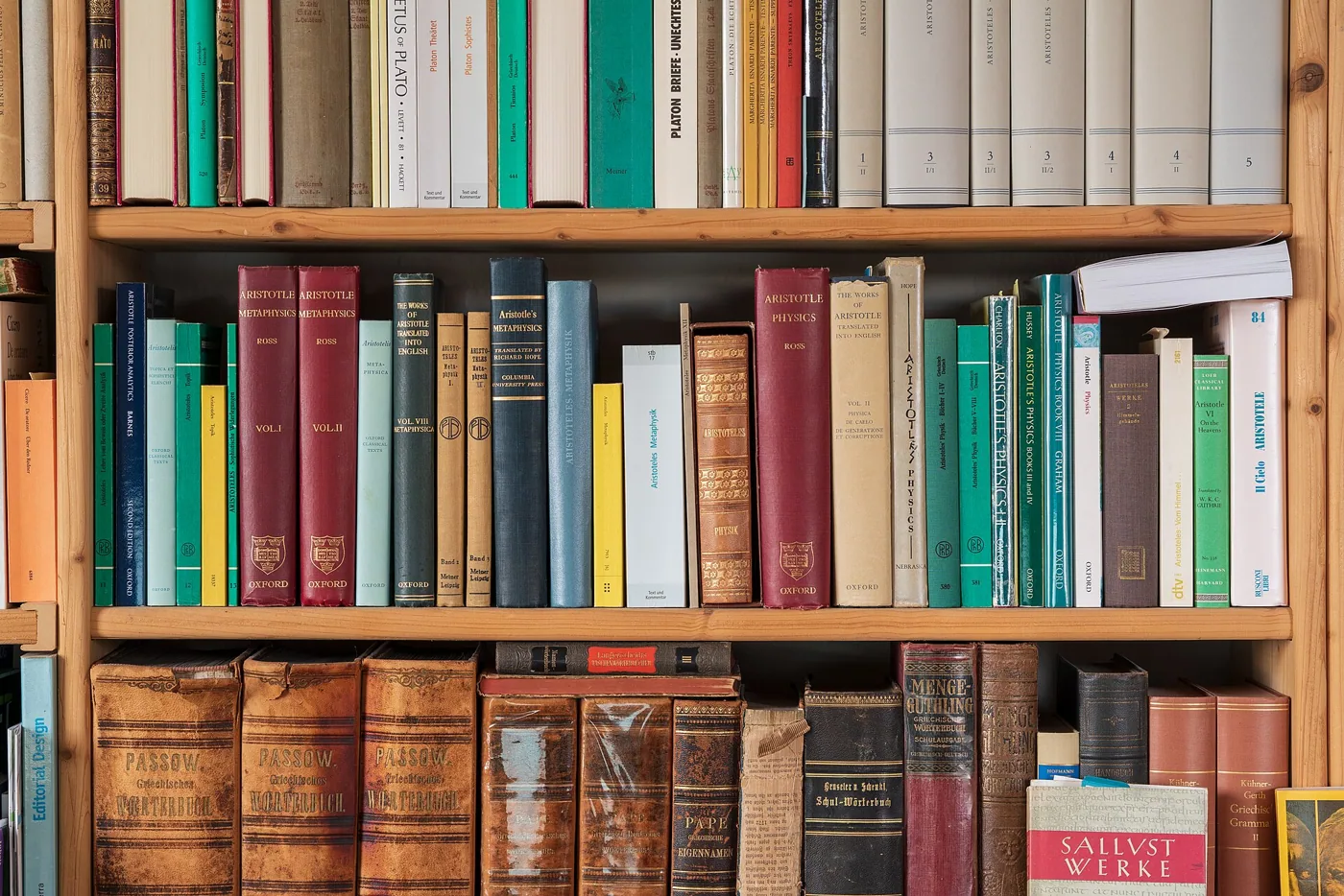
Books are heavy, and weight matters for both the look and the safety of the shelf. A shelf that carries a full row of hardbacks may sag, as explained in why bookshelves sag. Put the heaviest books on the lowest shelves, and the lighter objects on the top shelves. Place heavy items near the supports and ends of the shelf and keep the center lighter. This is the opposite of what looks natural, since people tend to put a heavy vase in the middle.
The look follows the same rule. A heavy visual weight at the bottom, such as large books, baskets or a closed cabinet, grounds the unit. Lighter, airy items at the top, such as a plant, a small frame or a few paperbacks, keep it from looking top-heavy. For a tall unit, a basket at the bottom takes the place of a drawer and hides the clutter.
Check that the unit is secure. A tall bookshelf that is styled with heavy objects needs to be anchored, a point covered in the guide to anchoring furniture. Never put anything fragile or heavy on the top shelf of a unit in a home with children and pets, where it can fall.
Choosing objects
The objects are the part that gives personality, and the rule of thumb is one or two per shelf, in odd groups across the unit. Pick objects with different shapes and materials: a ceramic bowl, a wooden box, a metal sculpture, a framed photo and a small plant. A mix of materials adds texture, and a mix of heights adds variety. Place the objects on a stack of books to raise them, and in front of books to break the line.
Scale them to the shelf. A tiny object on a tall shelf looks lost, and a large vase on a short shelf looks crammed. As a guide, an object should fill a third to half of the shelf height, and it should not touch the shelf above. Repeat a color or a material across the unit. If you choose a brass lamp on one shelf, find brass in a frame or a candlestick on another. This repetition creates rhythm, and it ties the shelf to the rest of the room.
Personal items make a shelf feel real: a family photo, a souvenir from a trip, a child's drawing in a frame. A few of these among the decor stop the shelf from looking like a catalog photo, and they give guests something to talk about. Group them by theme so they read as a collection.
Rhythm across the unit
A good shelf reads as a whole, not as a collection of separate boxes. The eye should be able to move across the unit in a zigzag, so place the highlights in a pattern. Put a large object on the top left, a stack on the second shelf to the right, an object on the third to the left and so on. This diagonal flow gives movement. A strict grid with the same item in the same place on each shelf looks stiff, and a random layout looks messy.
Limit the palette. Choose two or three colors and a neutral for the objects, and let the books bring the variety. If the books are colorful and varied, keep the objects neutral. If the books are mostly muted, add a bright accent. The principles are the same as in the guide to the 60-30-10 color rule, with the books as the dominant color.
Back panels and lighting change the effect. A shelf with a painted back in a contrasting color gives depth, and a strip light under a shelf adds drama, as explained in the LED strip lights guide. A pale back reflects light and a dark one makes the objects stand out.
A shelf-by-shelf recipe
If you want a plan to follow, take a five-shelf unit from the top down. On the top shelf, which is often out of reach and out of eye level, place light, tall items such as a plant, a basket or a large frame leaning against the back, and leave it fairly sparse. On the second shelf, at about eye level for a standing adult, put your most attractive arrangement: a few vertical books, a stack with an object on top and a small framed piece. On the middle shelf, which is the one you use most, keep the books you read and add a single object at one end.
On the fourth shelf, put the heavier, larger books, perhaps laid flat in two stacks with a bowl or box between them. On the bottom shelf, use baskets or closed boxes for the things that must be kept but are not attractive: chargers, papers, games and spare batteries. This simple order puts the lightest items at the top, the best display at eye level and the heaviest and ugliest things at the bottom, and it matches the weight and use that the unit has to carry.
Adapt the recipe to the unit. A narrow unit of 24 inches wide wants fewer objects and a vertical emphasis. A wide unit of 48 inches or more can carry a larger arrangement and a more complex rhythm. A built-in unit with a fixed depth of 12 to 14 inches takes books and objects set toward the front, and the shadow behind them gives depth.
Quick fixes for a shelf that looks wrong
If a shelf looks cluttered, remove a third of the objects before adding anything. If it looks dull, add one object with height, such as a tall vase or a leaning frame, and one with color. If it looks top-heavy, move the heavy things down and put a plant or something light on top. If the unit looks scattered, repeat one material, such as wood or brass, on three shelves. If it looks too formal, tilt a few books or lean a frame against the back, which relaxes the arrangement.
Check from across the room. Details that look fine up close disappear at a distance, and the main shapes and colors are what the eye sees. Squint to see the pattern. If you cannot tell the difference between the shelves at a glance, add variation. If the eye jumps from one spot to the next without a path, rearrange the highlights. Photograph the shelf and look at the picture, as a photo shows imbalance quickly.
Keep the unit alive. A bookshelf that never changes becomes invisible, so move an object, swap a book from the pile or change the plant every few months. A small change keeps the shelf fresh and costs nothing.
Small rooms, shelves with a TV and families
In a small room, styling must be restrained. A crowded shelf makes the room look cramped, so keep a few more gaps and use fewer objects. Choose closed storage for the bottom, as described in small living room storage ideas, and keep the open shelves for the best items. A shelf next to a TV should have a calm arrangement, so that it does not compete with the screen, and an alcove shelf can hold the TV in the center with books around.
In a family home, function wins. Keep books for children on the lowest shelf, where they can reach them, and fragile objects at the top. Use baskets for toys and give each child a shelf. A styled shelf can still look good if the objects are chosen for toughness: wood, metal and resin, not thin glass. And remember that a bookshelf is for books, so it should look lived in, with a few books out of order and a stack in progress.
Frequently asked questions
How do I arrange books on a shelf?
Mix vertical rows with horizontal stacks, vary the group sizes and leave small gaps. Put the heaviest books at the bottom and near the supports.
How many objects should be on a bookshelf?
One or two per shelf, in odd numbers across the unit. Scale them to the shelf height and repeat a color or a material for rhythm.
Should I arrange books by color?
It gives a calm, striking look but makes it harder to find books. Many people group by subject and keep a color order inside each group.
How full should a bookshelf be?
Leave about a third of the space empty, spread out in small gaps. Alternate dense and sparse shelves for rhythm.
How do I style a bookshelf in a small room?
Use fewer objects, closed storage at the bottom and more empty space. A calm arrangement helps the room feel larger.
Bottom line
Empty the shelf, sort the books and build the arrangement from the bottom up. Mix vertical and horizontal books, add one or two objects per shelf and leave space between groups. Put heavy items low and near the supports.
Repeat a color or a material across the unit, add a few personal items and keep the books you use close at hand. A bookshelf that looks good and works is one that people actually use, which means the books you reach for most should never be hidden behind a decorative object or a stack that has to be moved first.