The 60-30-10 rule is one of the few pieces of interior design advice that people remember exactly and apply badly. They know the numbers, then stand in the middle of a living room holding a paint chip and have no idea what counts as the 60. Is the floor part of it? Does a cream sofa count as a color? What about the TV, which takes up a fifth of one wall and is black?
This guide turns the rule into a method you can use in a real room. It explains where the rule comes from and where it does not, how to assign the three shares to actual surfaces, how neutrals fit in, how to check the balance with a photo and when to ignore the whole thing. The origin of the rule is not well documented, so the guide treats it as what it is: a useful heuristic for keeping a room from tipping into chaos or monotony.
What the rule actually says
The rule divides a room's color scheme into three levels of attention. The dominant color takes about 60 percent of what you see, and sets the mood. The secondary color takes about 30 percent and adds contrast and interest. The accent takes about 10 percent and provides the spark. A room with a calm gray-beige at 60, a deep teal at 30 and a copper at 10 follows the rule. A room with five colors of equal weight breaks it, and usually feels restless.
The logic is about visual hierarchy. The eye needs one place to rest, one place of contrast and a small place of surprise. When all colors compete at the same strength, there is no rest. When there is only one color, there is no interest. The 60-30-10 split is a convenient set of proportions that produces a hierarchy without much thought, and it works for the same reason that a photograph with a clear subject, a supporting area and a highlight looks composed.
It is a rule of thumb. There is no study that proves 60-30-10 is the ideal ratio, and the exact numbers are not important. Treat it as an instruction to have a clear main color, a secondary one and a small accent, and a reminder that the accent should be small.
Where each share lives in a living room
The easiest way to apply the rule is to assign each share to a type of surface. The 60 goes to the largest surfaces: walls, ceiling, a large area rug or fitted carpet and large pieces of furniture that fade into the walls. The 30 goes to the mid-sized elements: the sofa, armchairs, curtains, the TV unit and the bigger pieces of wood furniture. The 10 goes to the small items: pillows, throws, art, vases, lamp shades and books.
| Share | Typical surfaces | Example |
|---|---|---|
| 60 percent (dominant) | Walls, ceiling, large rug, built-ins | Warm white or soft gray walls |
| 30 percent (secondary) | Sofa, curtains, armchairs, TV console | Navy or olive sofa with matching curtains |
| 10 percent (accent) | Pillows, art, throws, lamp, vases | Rust, mustard or brass accents |
The rule does not demand that walls be the 60. In a room with painted walls in a neutral, the walls take that share. In a room with dark green walls and a pale sofa, the walls may be the 30 and the pale sofa and rug the 60. What counts is what the eye sees as the main field of color. Stand at the door, squint, and see what dominates.
The floor needs a decision. A large expanse of wood or tile is a surface, and it counts as part of the 60 or the 30, depending on its tone and how much of it shows. A large rug often takes over that role from the floor. A dark wood floor and a cream rug act as two shares, and the cream rug usually joins the dominant color. See the rug size guide for how much of the floor a rug covers.
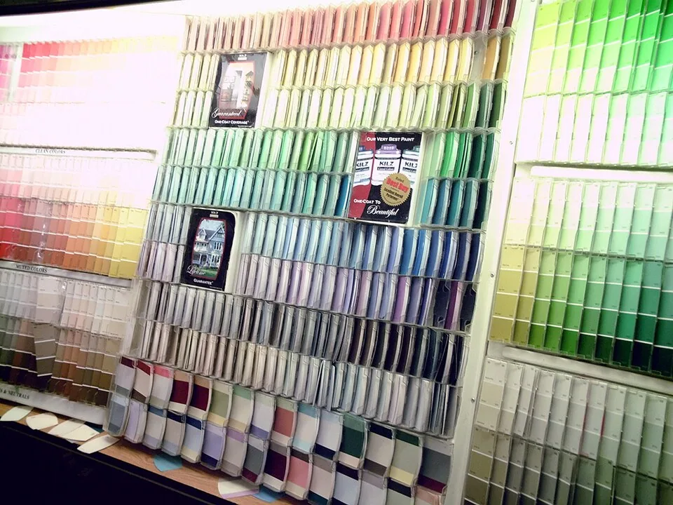
How neutrals fit in
The most common confusion is what to do with white, beige, gray, black and wood. Neutrals count. A room with white walls and a gray sofa has a neutral dominant and a neutral secondary. This is a perfectly valid scheme, and it needs an accent of color or texture to avoid looking flat. The rule works when the neutrals take the 60 and 30, and a color takes the 10, which is a popular modern layout.
Another option is to let a neutral take the 60, a color the 30 and a second color or a darker neutral the 10. A white room with a navy sofa and brass accents is one example, and a greige room with a forest green sofa and black frames is another. Black works as an accent in small amounts, such as a lamp base, picture frames and a TV, and the TV is an unavoidable black rectangle that you can fold into the plan by echoing it with other black elements in small touches.
Wood tones are neutral in practice but they have an undertone: warm or cool. Match the undertone across the room. A warm oak floor with a cool gray wall produces a clash that people sense as an unsettled feeling without being able to name it. Choose wall colors and fabrics with the same undertone, or use a color that bridges the difference, such as a greige, a mix of gray and beige. The issue of color temperature in light is separate but related, and the color temperature guide shows how light changes the undertone you see.
Choosing the three colors
Start with something fixed. Most rooms have an item you cannot or do not want to change: a floor, a large sofa, a rug or a piece of art. Take the dominant color or the secondary color from that item. If the sofa is a warm gray, make the wall a lighter or a warmer version of the gray, and take the accent from a color in a rug. Working from the fixed item prevents the problem of choosing three colors in the shop that do not work with what you own.
For the dominant color, pick something you can live with in every light. Light and mid-value colors are the safest, since they reflect light and make the room feel bigger. The effect of light reflectance and sheen is covered in the paint sheen guide. For the secondary color, choose a contrast in value or hue: darker, richer or more saturated than the dominant. For the accent, pick a color that is either an opposite on the color wheel, for energy, or a deeper shade of the secondary, for a quiet scheme.
Test with samples. Paint a large sample board, at least 2 by 2 feet, and tape it to the wall for a week. Look at it in the morning, at midday and in the evening. Place a fabric swatch and a pillow beside it. A color that looks right in a catalog can turn muddy or harsh in your room's light.
How to check the balance
Take a photo of the room from the main doorway, and view it at small size, or squint. The areas that stand out should roughly follow the split. If you see one patch that grabs attention, such as an orange armchair, that is the accent working. If three or four patches compete, the accent share is too big, and you should reduce the number of strong pieces. If the room looks flat, with no area of interest, the accent share is too small or too weak.
A simple test is the accent count. Count the places in the room where the accent color appears. A good number is three to five, spread across the room, such as a pillow on the sofa, a vase on a table and a picture on the wall. Fewer than three makes the accent look accidental, and more than six makes it look like a theme. Repetition across the room gives the eye a path to follow.
Be careful with pattern. A strongly patterned rug or curtain can be a color on its own, and it can take the 30 even if its area is small, since patterns attract attention. If you are using pattern, read the principles in how to mix patterns in a living room, which explains scale and a shared color.
When to break the rule
The rule has limits. A monochrome room, with different tones of one color, has no secondary color in the usual sense, and it works through variation in texture and value. A bold maximalist room with many colors in high saturation follows a different logic, with pattern and repetition holding it together. A small room with a dark color on all surfaces can be dramatic and cozy, and it does not follow the 60-30-10 split at all, though it still benefits from an accent.
Also relax the rule for a rented or a shared space, where you cannot repaint. If the walls are an unfortunate color and you cannot change them, treat the walls as the 60 and build the 30 and the 10 around them, using a rug, curtains and a sofa that either complement or neutralize the wall color. In such a case, a large rug in a neutral shade can reduce the impact of an unwanted wall color.
The final test is how the room feels. If it feels calm and interesting, you have followed the idea of the rule, whatever the numbers. If it feels restless, look for a fourth color, or an accent that has grown too large, and edit.

A worked example: one living room, three levels
Take a living room of 14 by 16 feet with a gray fabric sofa, a pale oak floor and a window on one wall. The walls are a warm off-white, which with the ceiling and the trim covers close to 60 percent of what you see from the doorway. The sofa, a pair of heavy curtains in a deeper gray-green and a wood TV console form the second level, roughly 30 percent. For the accent, choose a burnt orange, and repeat it in two pillows, a ceramic lamp base, the spine of a few books and a small framed print: five appearances, adding up to about 10 percent of the visible area.
Now see what happens when a rule is broken. Add a mustard armchair, a purple throw and a pink rug, and the room has four accents, each demanding attention. The fix is to edit, not to repaint: remove the purple and pink, move the mustard chair to another room or recover it in the gray-green, and the room settles. The reverse fault is a room with no accent at all, where everything is gray and cream and the eye has nowhere to go. A single orange object in the right place, a lamp or a pillow, is enough to wake it up.
The same method works in a bolder room. If the walls are a deep green, treat them as the 30 and add a pale rug and a light sofa as the 60, with a brass lamp and an amber vase as the accent. The proportion on the plan may not match the numbers exactly, but the hierarchy does, and that is what the eye reads.
Mistakes people make with the rule
The first mistake is treating the rule as a paint formula, painting 60 percent of the room one color and measuring the rest. The rule is about what you see, not the square footage of surfaces, and a dark sofa takes more of the visual weight than its area suggests. The second is choosing the accent first and then trying to fit the room around it, which often leads to an accent that is too large. The third is forgetting texture. Three colors in flat, matte finishes look thin, and the same colors in wool, linen, wood and metal look rich, because texture adds the variation that a limited palette lacks.
A fourth mistake is ignoring the connection between rooms. If the living room opens onto a hall or a kitchen, the dominant color should relate to those rooms, or the transition feels abrupt. Choose a shared dominant and let each room have its own secondary and accent. Finally, do not repaint everything to follow the rule when a few changes will do. Moving four pillows and a throw can fix a color problem that no amount of paint would solve.
Frequently asked questions
Do neutrals count in the 60-30-10 rule?
Yes. White, beige, gray and wood count as colors for the purpose of the split. Many successful rooms have neutrals as the 60 and 30 and a color as the 10.
Is the floor part of the 60?
It can be. A large expanse of floor or a large rug counts as a surface and joins the dominant or secondary share depending on its tone and how much shows.
Does the TV count as a color?
It is a black rectangle, so treat it as part of the accent or the dark neutral, and echo it with other black or dark elements in small amounts.
How many accent pieces should I use?
Three to five, spread across the room, so the accent looks planned. One looks accidental and many looks cluttered.
Can I use more than three colors?
Yes, if some are tints or shades of the same hue, or if the extra colors appear in small amounts. The rule is about hierarchy, not an exact count of colors.
Bottom line
Use the rule as a way to organize color: a dominant main field, a secondary contrast and a small accent. Assign them to surfaces, count neutrals, and test the result with a photo.
Start from what you cannot change, repeat the accent three to five times and relax the split when the room has a different logic. A clear hierarchy of color matters more than the numbers.