Painted a living room, hung new curtains and then switched on new bulbs, only to find the walls look yellow, grey or oddly green? The cause is often color temperature. Two bulbs with the same lumens and the same shape can make the same wall look warm and welcoming or flat and clinical, and the difference is a number on the box that most people skip: the kelvin rating.
This guide explains what the kelvin number means, what 2700K, 3000K and 4000K look like on warm and cool walls, why mixing temperatures in a single room is the mistake that matters, and how the color rendering index decides whether wood, fabric and skin look natural. It uses real ranges and settings, not a one-size answer.
What the kelvin number means
Color temperature compares a light's color to that of a glowing object heated to a given temperature, measured in kelvins. A candle flame is about 1800K, an old incandescent bulb 2700K, midday sun 5500 to 6500K and an overcast sky about 7000K. Lower numbers are warmer, more yellow and orange, and higher numbers are cooler, more white and blue.
It is counterintuitive that the warm colors have the low numbers, since in everyday language we call red hot. The kelvin scale follows physics, not feel, and what matters for a home is the practical range of 2200K to 5000K. Bulbs are labeled by names too, such as warm white, soft white, neutral white, cool white and daylight, but the names vary by maker, so use the number.
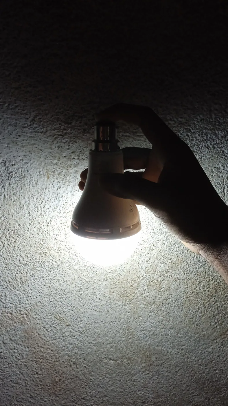
2700K: the warm classic
2700K is the color of a traditional incandescent bulb, and it is the standard warm white for living rooms. It has an amber tone that flatters skin, wood and warm fabrics, and it feels cozy, relaxed and evening-like. It makes reds, oranges and browns look rich, and it softens blues and greens.
The weakness is that it can make cool colors look dull. A grey or a blue wall can turn muddy under 2700K, and a white wall can look cream or yellow. In a room with lots of daylight, the contrast between warm lamps and cool daylight can look strange at dusk. 2700K is the best choice for a room used in the evening, with warm wood tones, beige or cream walls and fabrics in earth tones.
3000K: the clean warm white
3000K is slightly cooler and cleaner, a warm white that looks less orange than 2700K. It is common in halogen bulbs and in many modern fixtures, and it renders whites and light colors more accurately. It suits rooms with white or grey walls, modern furniture, and spaces that get a lot of natural light, where a very warm bulb would clash with the daylight.
The difference between 2700K and 3000K is subtle, about the difference between a cozy living room and a bright kitchen in feel. If you are unsure, choose 2700K for the lamps and 3000K for the ceiling or accent light, but keep the difference small, within 300K, so the room does not look patchy. In a room with cool walls, 3000K avoids the muddy effect that 2700K can cause.
| Temperature | Appearance | Best for | Watch for |
|---|---|---|---|
| 2200K to 2400K | Deep amber, candle-like | Dimmed accent, bedside | Muddy colors, low brightness |
| 2700K | Warm white, cozy | Evening living rooms, warm walls | Dulls blue and grey walls |
| 3000K | Clean warm white | Modern rooms, white or grey walls | Slightly less cozy |
| 3500K to 4000K | Neutral white | Kitchens, work areas, task | Cool and clinical in a lounge |
| 5000K to 6500K | Daylight, bluish | Garages, workshops | Harsh, sleep-disrupting at night |
How temperature interacts with wall color
Light and paint work together. A warm wall, such as cream, beige or terracotta, looks richer under 2700K and a little flat under 4000K. A cool wall, such as soft grey, blue or sage, looks accurate under 3000K and dull under 2200K. White walls take on the tint of the light, so a 2700K lamp turns a white wall into a creamy one, and a 4000K bulb leaves it white or slightly cool.
The fixed items matter too. Wood floors and furniture look warmer and more golden under 2700K, and paler and greyer under 4000K. Test the temperature with the actual materials: hold a paint sample and a piece of fabric under the bulb in the evening, and compare it with how you want it to look. A bulb that flatters the sofa but turns the wall grey may need a change in temperature or paint.
The real mistake: mixing temperatures
More rooms are spoiled by inconsistency than by the wrong single choice. A ceiling fixture at 4000K, a floor lamp at 2700K and a table lamp at 3000K produce three different whites on the same wall, so the wall looks striped and the room feels unplanned. The eye is sensitive to differences between adjacent light sources, and it notices a 500K gap quickly.
The rule is to keep all the lights in a room within about 300K of one another, and to use one temperature in any area you see at once. Check all the bulbs, including those in lamps you rarely use, in a hallway you can see from the living room and in under-cabinet strips. If you cannot match the bulbs, use a tunable white or smart bulb that you can set to the same value, as we explain in our guide to smart bulbs.
Daylight, time of day and the body
Natural light changes color through the day, from the warm glow of early morning to the cool blue-white of noon and back to amber at sunset. Artificial light that follows the same pattern feels natural, and light that does not can feel wrong. In the evening, warmer light supports relaxation, and many people find cooler, bluer light stimulating and less suited to the hour before sleep.
The research on blue-enriched light and sleep is still developing, so this guide does not make medical claims. A practical approach is to use 2700K or lower in the evening, and to dim the lights as the night goes on. In the day, 3000K to 4000K works for tasks, and a room with a lot of daylight can use cooler bulbs without clashing. Warm, dimmed light in the evening is a comfort choice with a sound basis, and a person with a sleep concern should talk to a doctor.
CRI: why color rendering matters
Color rendering index, or CRI, measures how accurately a light shows colors compared with a reference source, on a scale of 0 to 100. Incandescent bulbs score 100, and cheap LEDs can be as low as 70 to 80. A low CRI makes wood look flat, fabrics dull and skin tones sallow, even when the kelvin value is right.
For a living room, look for a CRI of 90 or higher. The difference is easy to see: a red cushion under a 80 CRI bulb looks brownish, and under a 95 CRI bulb it looks red. The R9 value, which measures deep red rendering, is a more specific measure, and a high R9 helps wood, skin and food. Higher CRI bulbs cost a bit more and may be a little less efficient, but for a room where you sit and look at your own furniture, they are worth it.
Choosing by room type and style
For a traditional or warm-toned living room, 2700K with a CRI of 90 or higher is the safest. For a modern room with white and grey walls, 3000K is better, and 2700K can still work if the room is mostly used in the evening. For a room with a mix of daylight and lamps, choose 3000K as a bridge. For a media room, a lower temperature of 2200K to 2700K and a low level help reduce glare on the screen.
Whichever you choose, apply it across the room. Replace all bulbs at once, or at least in each zone, and avoid a mixture of old and new. If you use a dimmer, choose a bulb that warms as it dims, a feature called dim-to-warm, which mimics an incandescent and is a good fit for a living room. Our guide to layered lighting shows how the different layers use a consistent color.
What temperature does to wood, fabric and skin
Furniture finishes respond strongly to the light. Honey oak and walnut look golden and deep under 2700K and a little yellow-green and flat under 4000K. A white or grey sofa shifts toward cream under warm light and stays crisp under 3000K. Terracotta and rust fabrics glow under warm bulbs and look brownish under cool ones, and blue upholstery can look black in a dim, warm room.
Skin tones matter as well, since people sit in the room. Warm light with a high CRI is flattering and makes faces look healthy, and a cool light with a low CRI makes people look tired. If the room has an open plan with a kitchen, the same rule applies to the food and the wood, and keeping a single temperature through the space avoids sudden shifts.
Televisions, screens and bias light
A television shows its own color, and the room's light affects how it looks. A very warm or very bright room can wash out the picture, and a dark room with a bright screen causes eye strain. A low level of neutral light behind the screen, called bias lighting, reduces the contrast and makes viewing more comfortable, and it works best near 6500K for color accuracy, though many people prefer a warmer glow for comfort.
For a living room used for both films and conversation, put the screen-side lights on a separate switch or a smart plug, so they can be dimmed. Avoid placing a bright, bare bulb in the line of sight. Our guide to layered lighting explains how to place the sources so they do not reflect on the screen, and a dimmer gives the control to adjust.
Matching old fixtures, halogens and mixed bulbs
If you have a mix of old halogen, compact fluorescent and LED bulbs, the colors will not match, and replacing them all is the cleanest answer. Halogens are near 2800K to 3000K with a CRI of 100, and a good LED at 2700K with a CRI of 95 is a close replacement. Compact fluorescents often sit at 2700K but with a poor CRI and a slow warm-up.
When replacing bulbs in a set of fixtures, such as a ceiling fixture with four sockets, change all of them together, and use the same make and model, since two bulbs labeled 2700K from different makers can differ by 100K to 200K. A batch of bulbs bought at one time and one place matches better. Keep a spare so that a failed bulb can be replaced with the same one.
How to test before you commit
Buy one bulb at each of two temperatures and try them in the lamps you will use. Look at the room in the evening with the curtains drawn, and note how the walls, floor and sofa look. Take a photo with your phone on each setting, with auto white balance off if possible, and compare. Leave each bulb on for a couple of evenings, since the first impression can change.
Check how it looks beside daylight at dusk, and how it looks with the television on, since a screen has its own color. A bulb that looks perfect in the shop may look wrong at home. If it does, return it and try the other. A small test saves a whole room of bulbs, and our guide on lumens helps pick the brightness at the same time.
Frequently asked questions
Is 2700K or 3000K better for a living room?
2700K is warmer and cozier and suits evening use and warm walls. 3000K is a clean warm white that suits modern rooms and cool walls. The difference is small, and consistency matters more than the choice.
Can I use daylight bulbs in a living room?
You can, but 5000K and above looks cold and clinical in most homes. It suits a workshop or a garage. If you want a bright, neutral light, 3500K to 4000K is the upper limit for most living rooms.
Why do my walls look yellow at night?
A warm bulb on a white or cream wall adds an amber tint. If you want the wall to look whiter, use 3000K or a bulb with a higher CRI. A paint with a cooler undertone also helps.
What if my situation is different, such as a room with north-facing windows?
North light is cool and blue, so warm bulbs at 2700K balance it in the evening. In the day, the room is cool, and a warmer lamp can add comfort. Choose paint and fabric in warmer tones if the room feels cold.
Does color temperature change when I dim a bulb?
Standard LEDs keep the same color as they dim, while dim-to-warm LEDs shift toward amber, like an incandescent. Check the label if you want that effect.
Bottom line
Pick one temperature for the room, 2700K for warm, cozy rooms and 3000K for modern or cool-toned ones, and keep every bulb within 300K of it. Choose a CRI of 90 or higher so wood and fabric look true, and test the bulbs in your own room at night before replacing them all.
The biggest improvement comes from consistency, not from a perfect number. For how we weigh lighting details in our picks, see how we evaluate products.